Why I’m returning to the drawing board—and repainting the covers of an entire series so that they finally feel unmistakably mine.
The Roo’s Garden books have been part of The World of Roo for some time, but recently I began to feel that their covers no longer represented the books—or me—as well as I wanted them to.
So I have embarked upon a rather daunting project: giving the whole series a new hand-painted look.
There are ten individual stories in Roo’s Garden, each featuring a different woodland character and taking place during a particular season. My aim is to create covers that look distinctive individually, but also belong together when the books are displayed as a collection.
Why change a finished cover?
Redesigning a published book is a difficult decision. The existing covers are finished, colourful and polished. It would certainly be easier to leave them alone and move on to something new.
But the more I painted for my recent books, the more important it became that the covers of my earlier stories should reflect my own ink-and-watercolour style too.
I want readers to see the texture of the paper, the movement of the paint and the little variations that make a handmade illustration unique. I also want the covers to give a truer impression of what lies inside: gentle woodland stories filled with individual characters, changing seasons and the small dramas of garden life.
A cover has an important job to do. It needs to attract attention as a full-sized book, remain clear as a tiny online thumbnail and immediately suggest the mood of the story. Trying to achieve all three while keeping the artwork loose and natural is proving quite a balancing act.
Beginning with Ruben Redfeather
One of the first covers I chose to tackle was Ruben Redfeather.
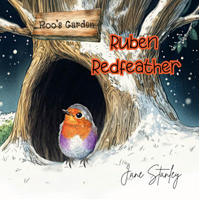
The earlier cover showed Ruben standing beside the hollow of a large snow-covered tree. It created a dramatic winter setting, but for the new version I wanted something simpler, quieter and more atmospheric.
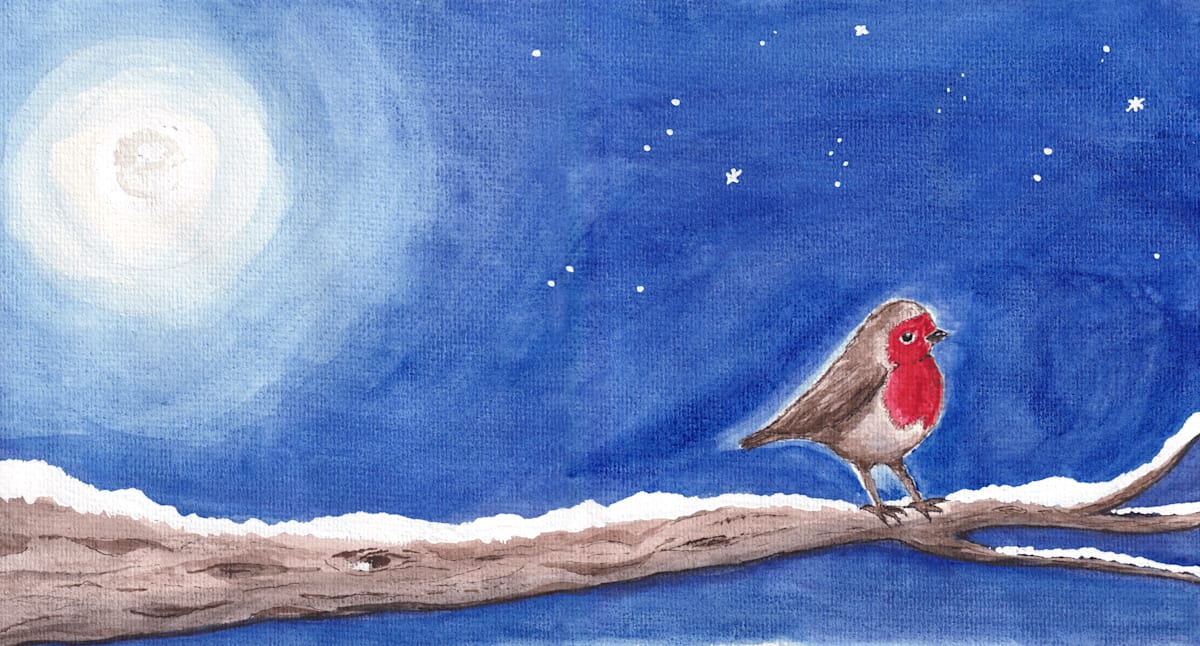
My new painting places Ruben on a long, snow-covered branch beneath a deep blue night sky. A pale moon glows on the opposite side, while small stars scatter across the darkness. Ruben’s red breast provides the bright point of colour within the wintry scene.
The branch stretches across the complete cover, helping the front and back feel like one continuous landscape. The uncluttered sky also leaves room for the title and allows Ruben himself to remain the focus.
At least, that was the plan.
The difficult middle stage
There is always a point during a painting when I become convinced that I have ruined it.
A digital image can look smooth and impressive very quickly. A watercolour painting rarely does. It goes through awkward stages: colours dry differently, washes behave unpredictably and a character may look slightly peculiar until the final details are added.
Comparing an unfinished painting with a polished digital cover is particularly dangerous. The handmade version can suddenly seem rough or inadequate—even when that visible texture is precisely the reason for painting it.
I had one of those wobbles with Ruben. After spending hours looking at the deep blue sky, I began to wonder whether the whole thing looked hopeless. I stepped away, had a coffee and gave Roo a cuddle or two. Both helped.
Once the paint had dried and the pieces began coming together, I could see what the new cover possessed that the old one did not. It carried my marks, my decisions and my interpretation of Ruben’s winter world. It felt personal.
A title sign painted by hand

The redesign goes beyond the character illustrations.
Each book will have its own wooden name plaque, painted and lettered by hand. Ruben’s has a dusting of snow along the top, tying it into the winter scene. Longer character names may need two lines while shorter ones can sit neatly on one, but the signs will share the same overall style.
I’m also creating seasonal borders for the interior text pages, with different natural details for spring, summer, autumn and winter. Books set within the same season can share visual elements, helping the series feel connected without making every title look identical.
Ten covers, one garden
Ruben is only the beginning.
Milo Mettlewick’s new spring cover takes him to a mossy stone wall beneath a pale blue sky. Felix Fleetfoot will bring movement and warmth to summer, while autumn leaves, berries, acorns and late-afternoon colours will help create the worlds of Hugo Hazelwood and Saffy Sycamore.
Each character needs a cover that reflects their own personality, while the complete collection must still look as though every story belongs in the same garden.
It is a much larger job than simply replacing one picture with another. It involves revisiting the characters, checking the stories, reconsidering the typography and making countless small decisions about colour, spacing and composition.
There will undoubtedly be more wobbles along the way.
But when I eventually see all ten books together, I hope they will feel warmer, more cohesive and much more personal. Most importantly, I hope readers will be able to look at them and know that they have entered Roo’s Garden—a little world painted, written and created with love.